"Bright" & "Expanding Space" Interpret a Cozy Japanese Nook
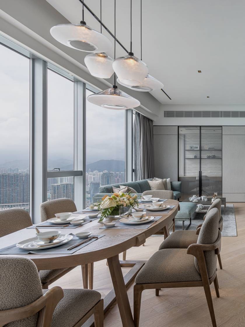
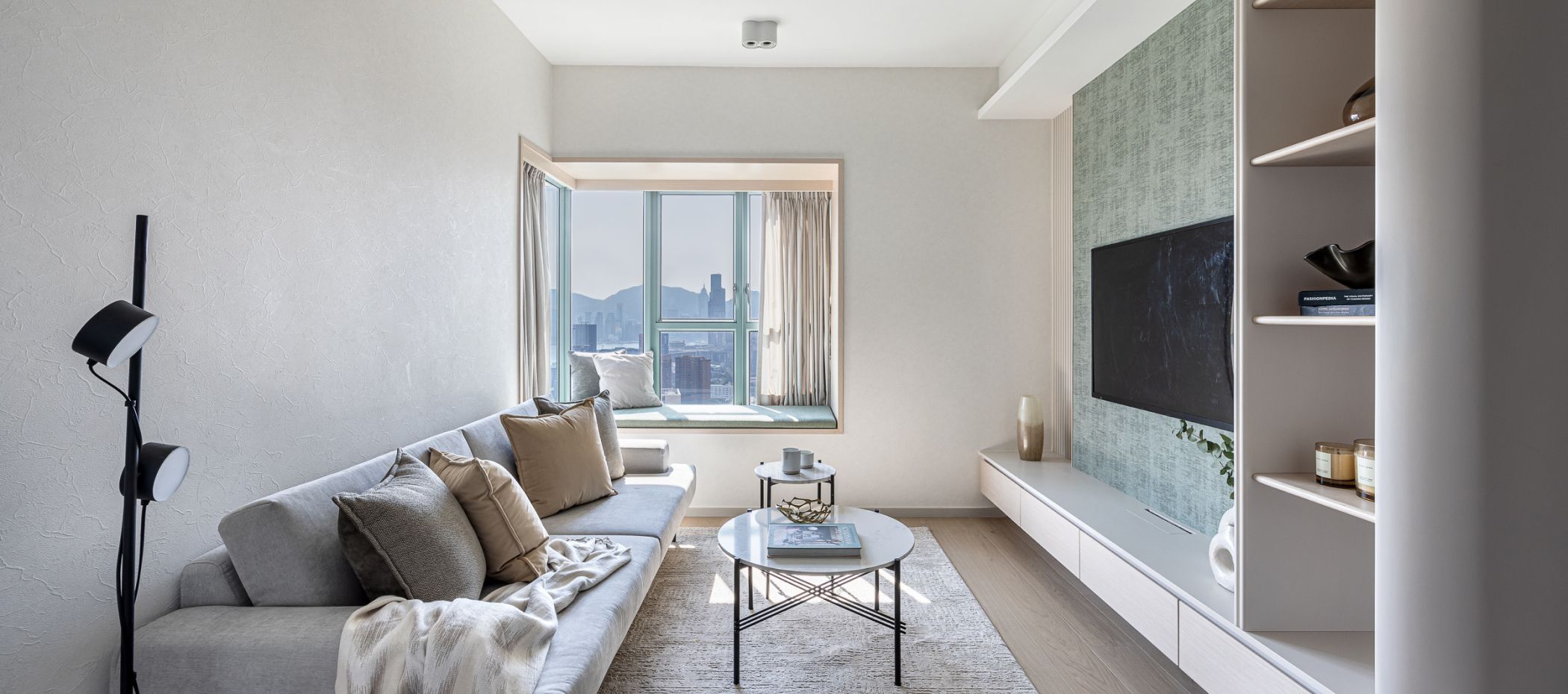
The design at Carmel On The Hill in Ho Man Tin is specifically crafted for single residents, different from traditional family living spaces, yet exuding the elegance of a large home design. The core concept of this renovation focuses on "expanding the space" and "brightness," aiming to create an ideal private living environment for the homeowner. This design utilizes a simple color palette as the base, complemented by soft lake green accents, creating a comfortable Japanese-style leisure atmosphere. This color combination not only makes the space appear more open but also effectively enhances overall lighting, filling every corner with vitality.
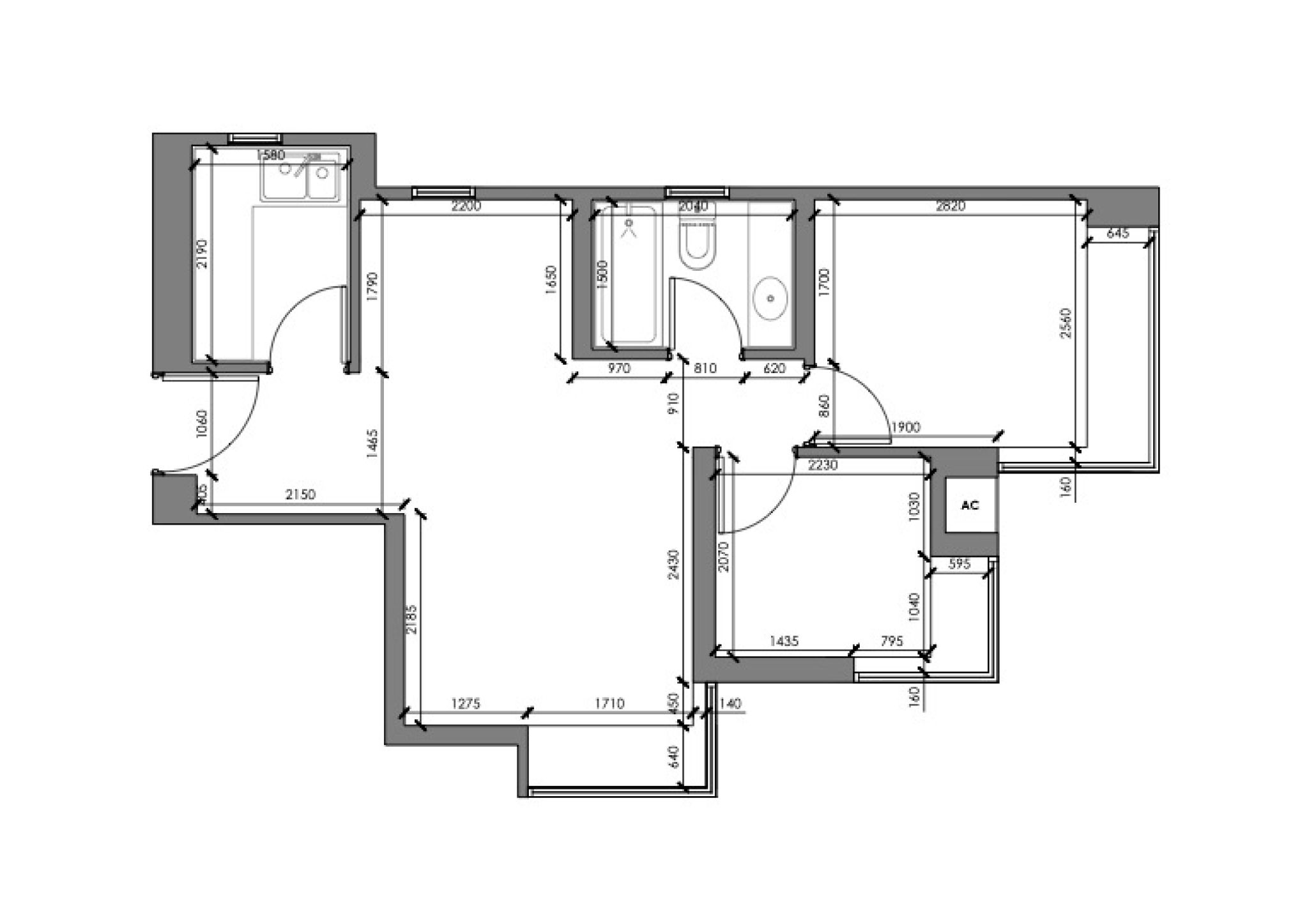
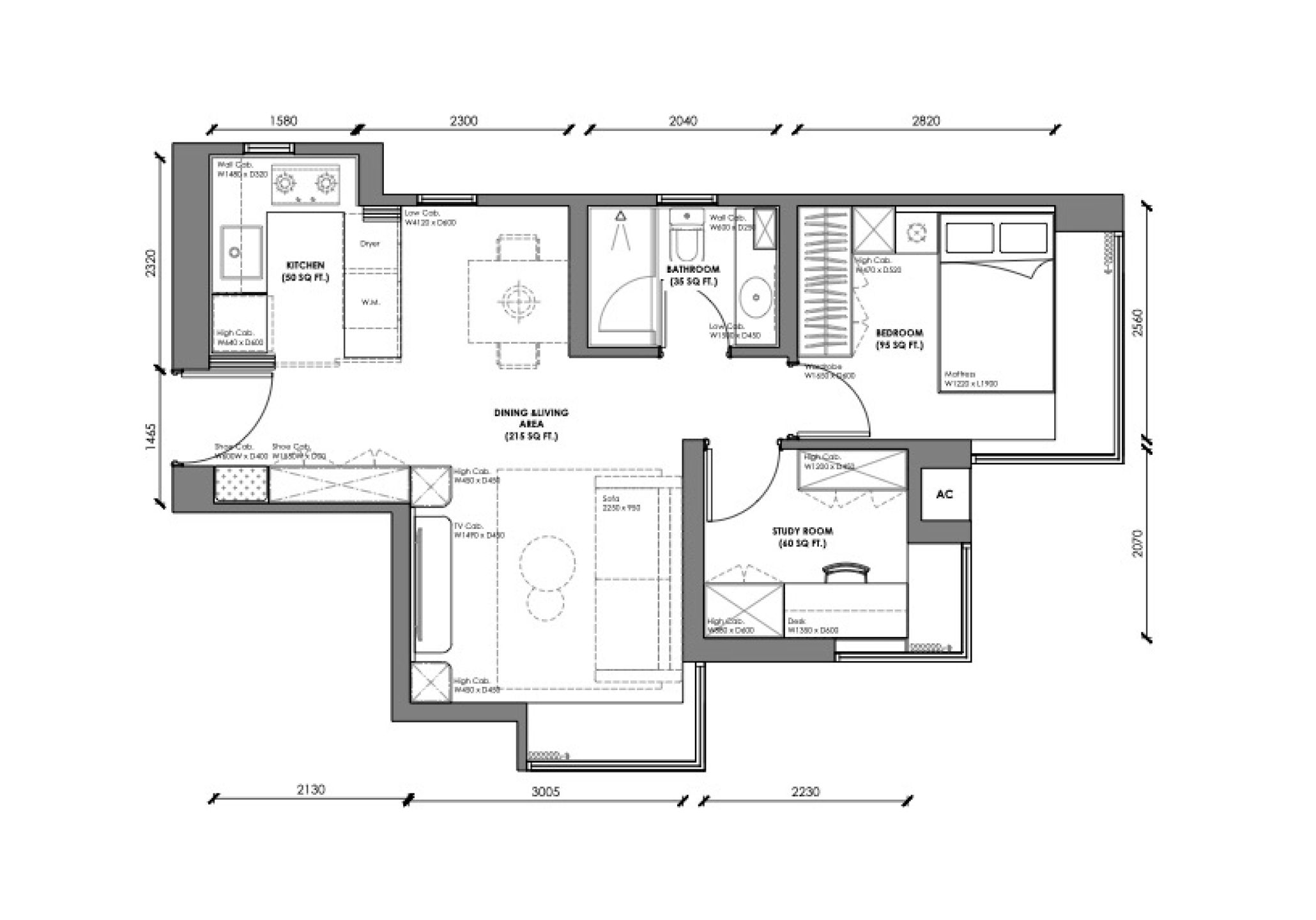
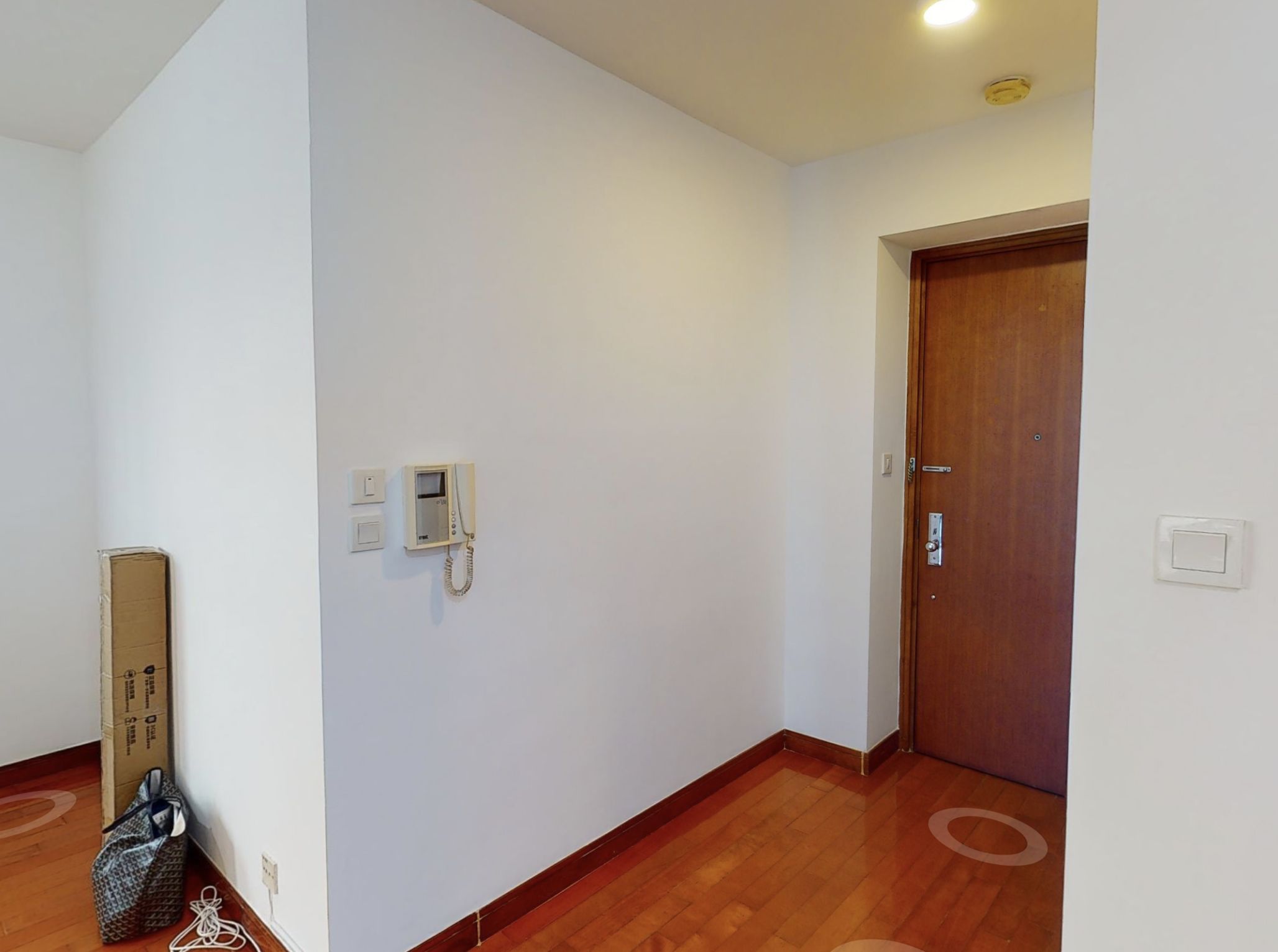
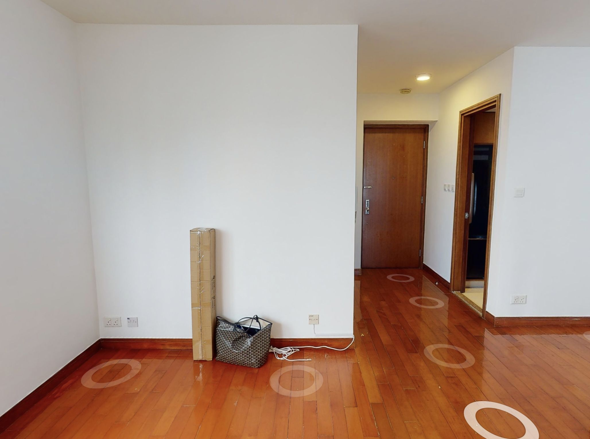
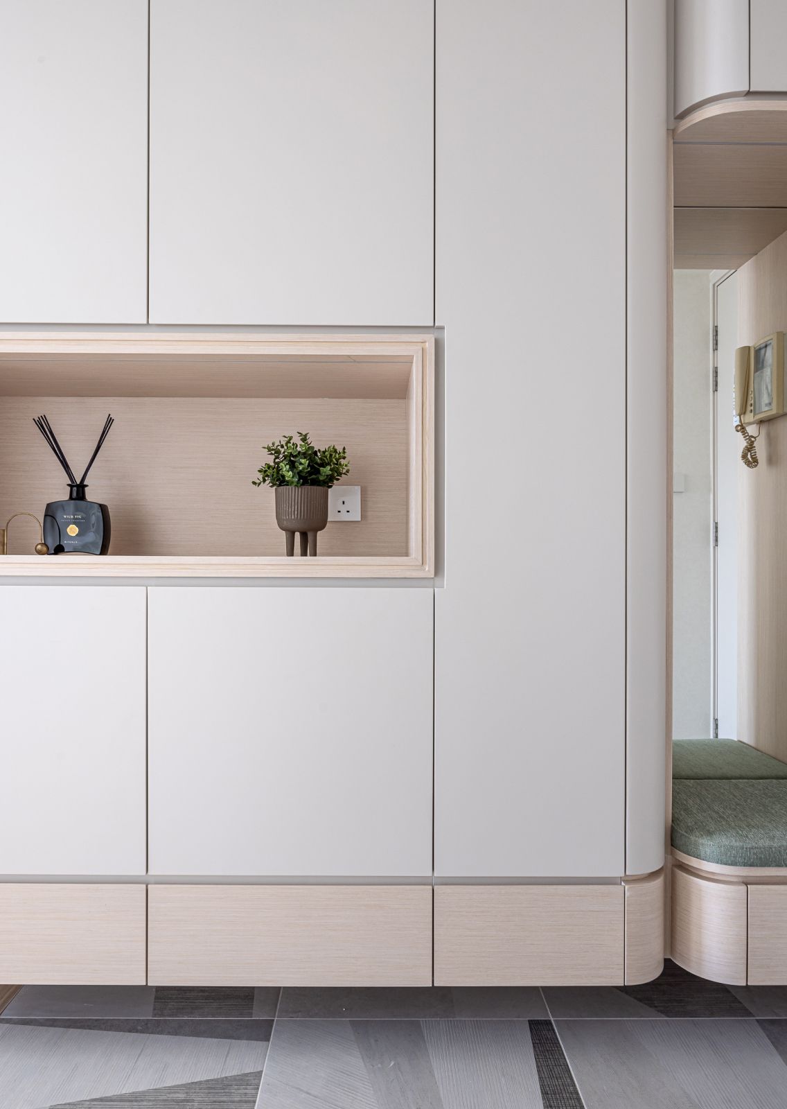
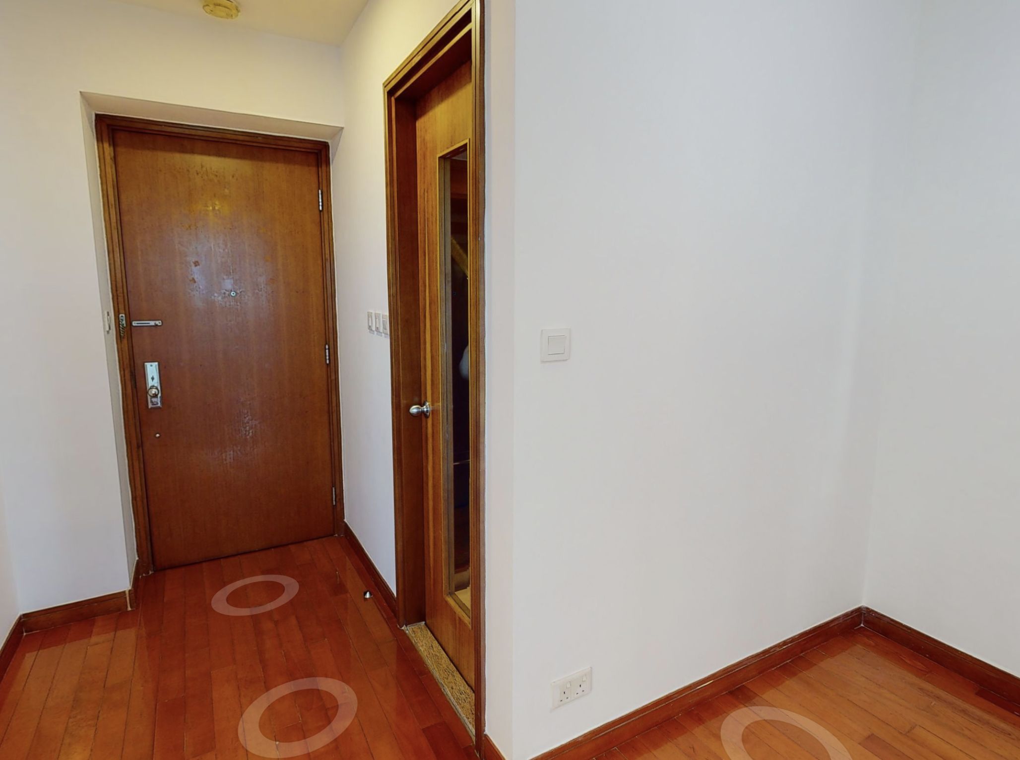
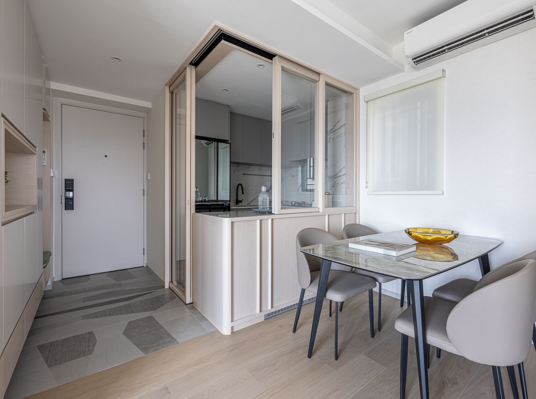
The original unit featured a more outdated design and lacked a proper entrance space. After the renovation, our team introduced an L-shaped off-grounded cabinet to the living area, incorporating a seat in the middle for the homeowner to change shoes. This design significantly reduces the visual pressure of the cabinet in the hallway and aligns the entrance area more effectively.
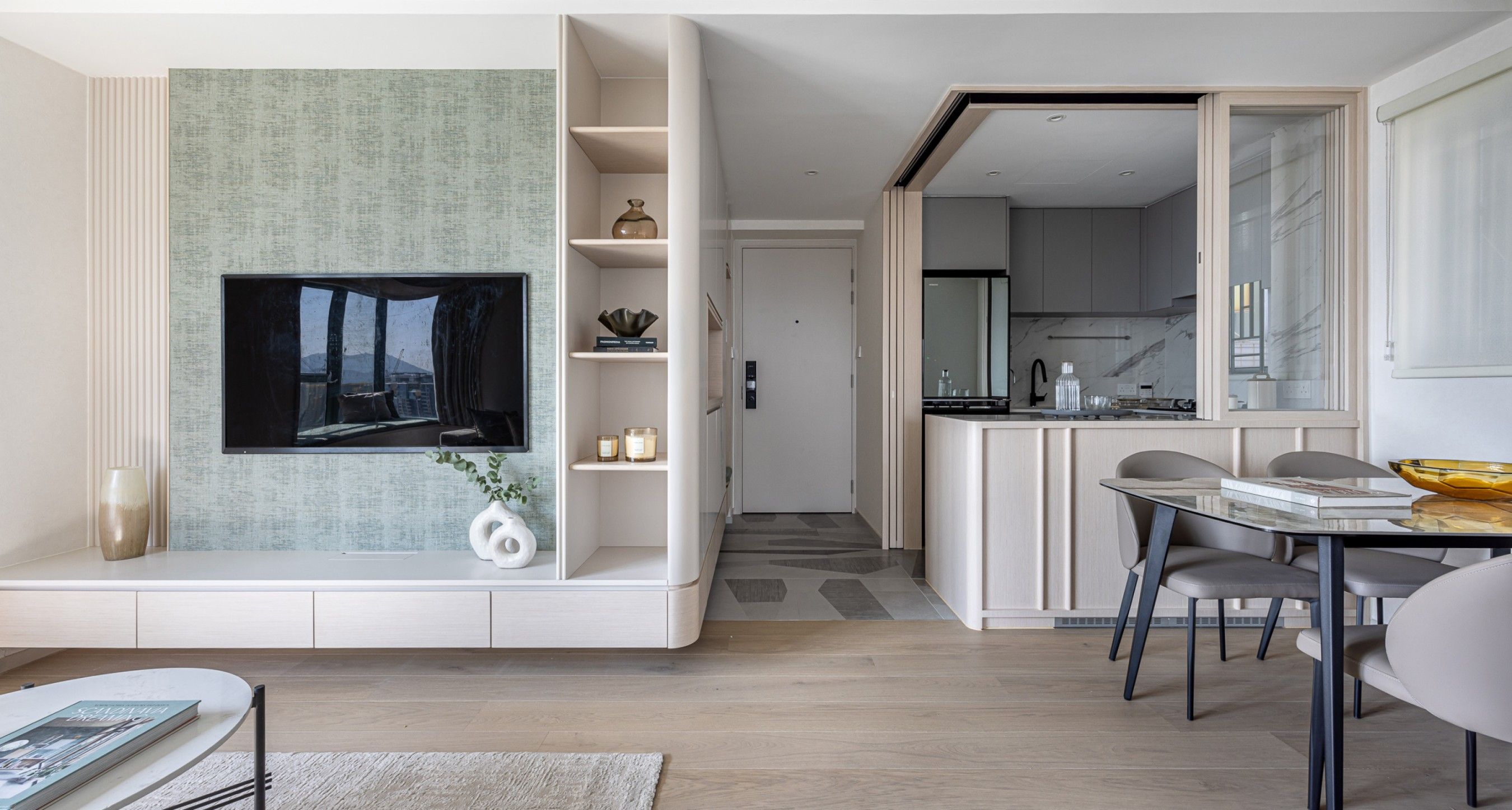
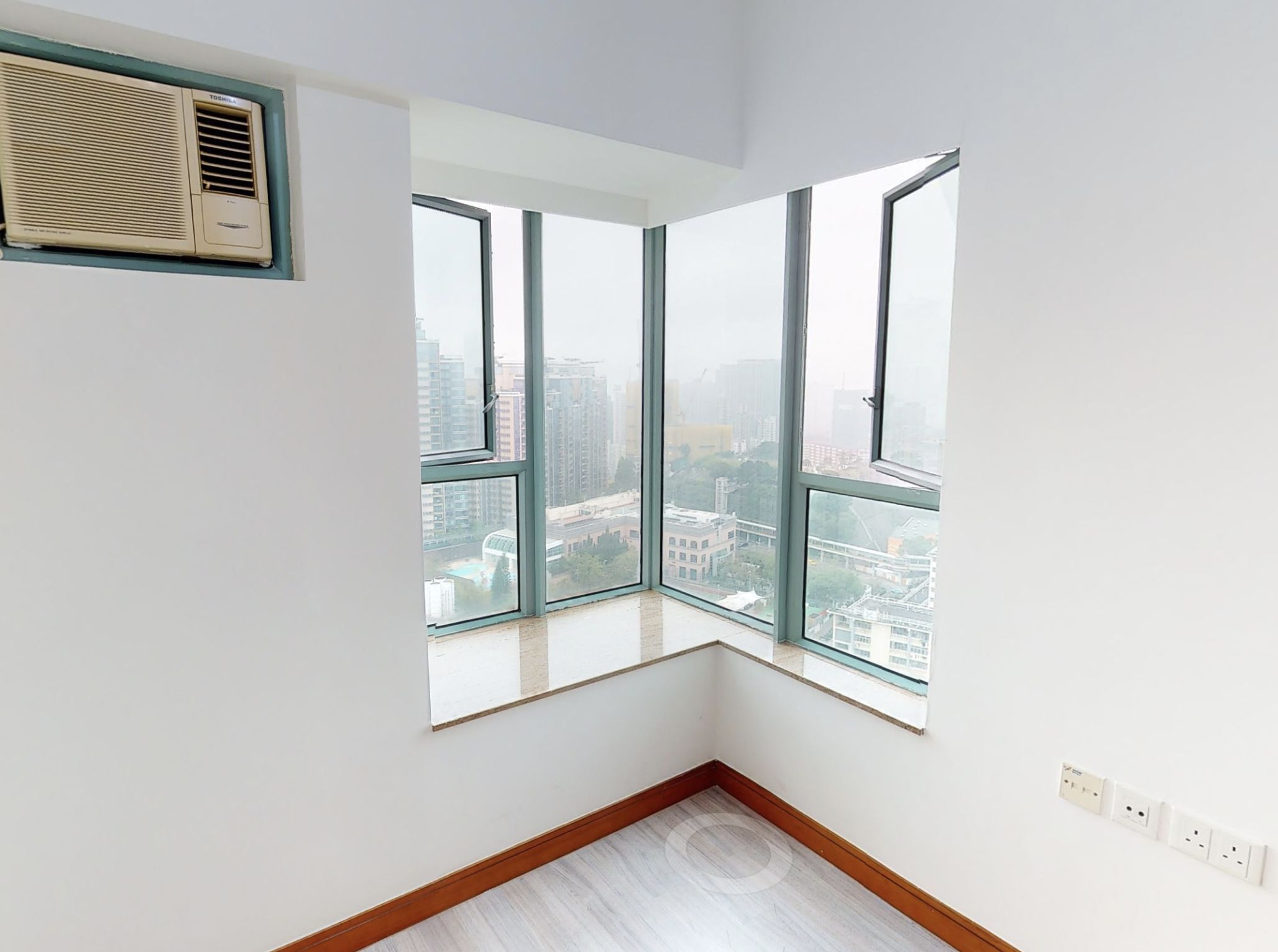
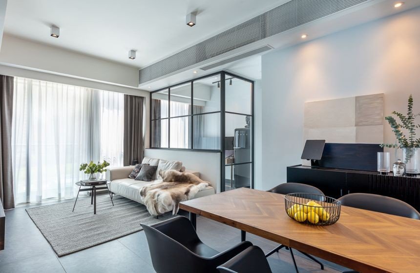
The walnut flooring and white walls before the renovation appeared outdated. The new design adopts a minimalist style, featuring soft color tones paired with light wood, introducing more natural light and expanding the space. To accentuate the TV wall, the homeowner chose wallpaper in a pastel green tone, complemented by striped patterns. We can see the extensive use of curves throughout the living room to soften the corners of the furniture, reducing the chances of collisions and adding fluidity.
To better highlight the theme of "expanding space," we removed the original kitchen partition wall and replaced it with glass partition windows that can be opened and closed. This not only extends the overall space of the living and dining areas but also enhances transparency. The design is both practical and demonstrates a keen understanding of spatial dynamics.
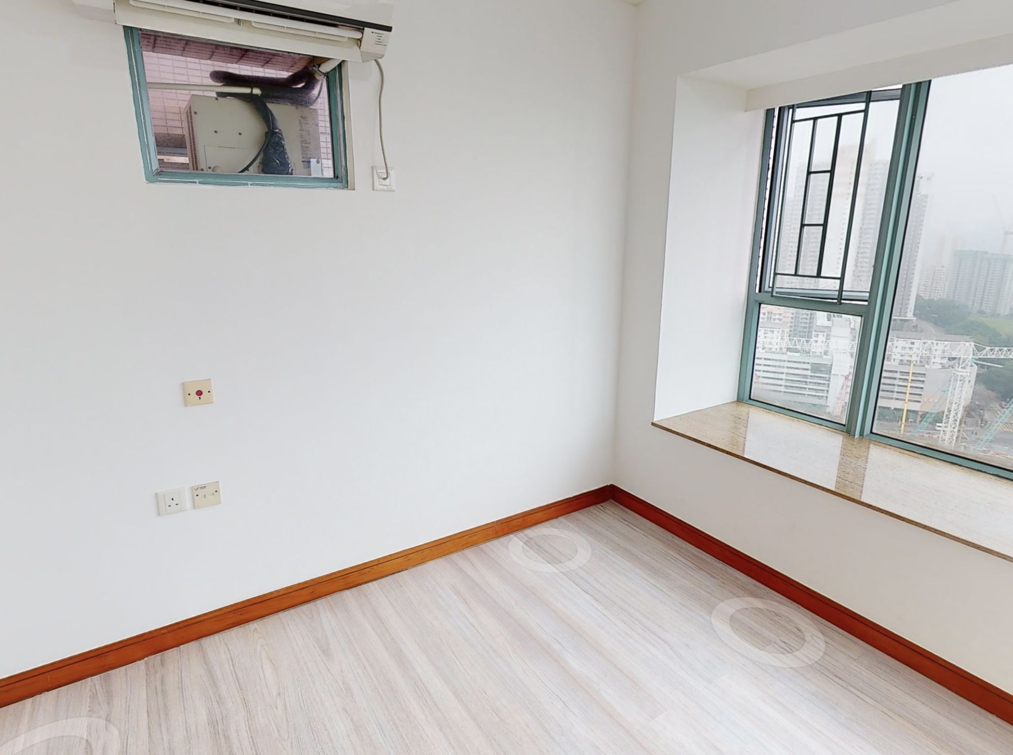
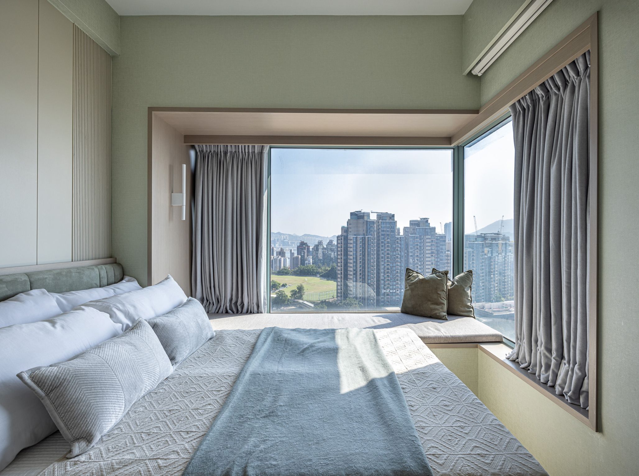
The layout of the homeowner's rest area also underwent changes to accommodate his desire to separate relaxation from work. We retained the original two-room partition. The master bedroom maintains a minimalist style, with color tones that flow seamlessly from the living areas. To make the most of every inch of space, the design incorporates modular furniture, including a built-in wardrobe. The bedroom's window sill occupies part of the space, so they reintroduced a cushion and bedside lamp. This setup allows the homeowner to enjoy a tranquil view outside while reading.
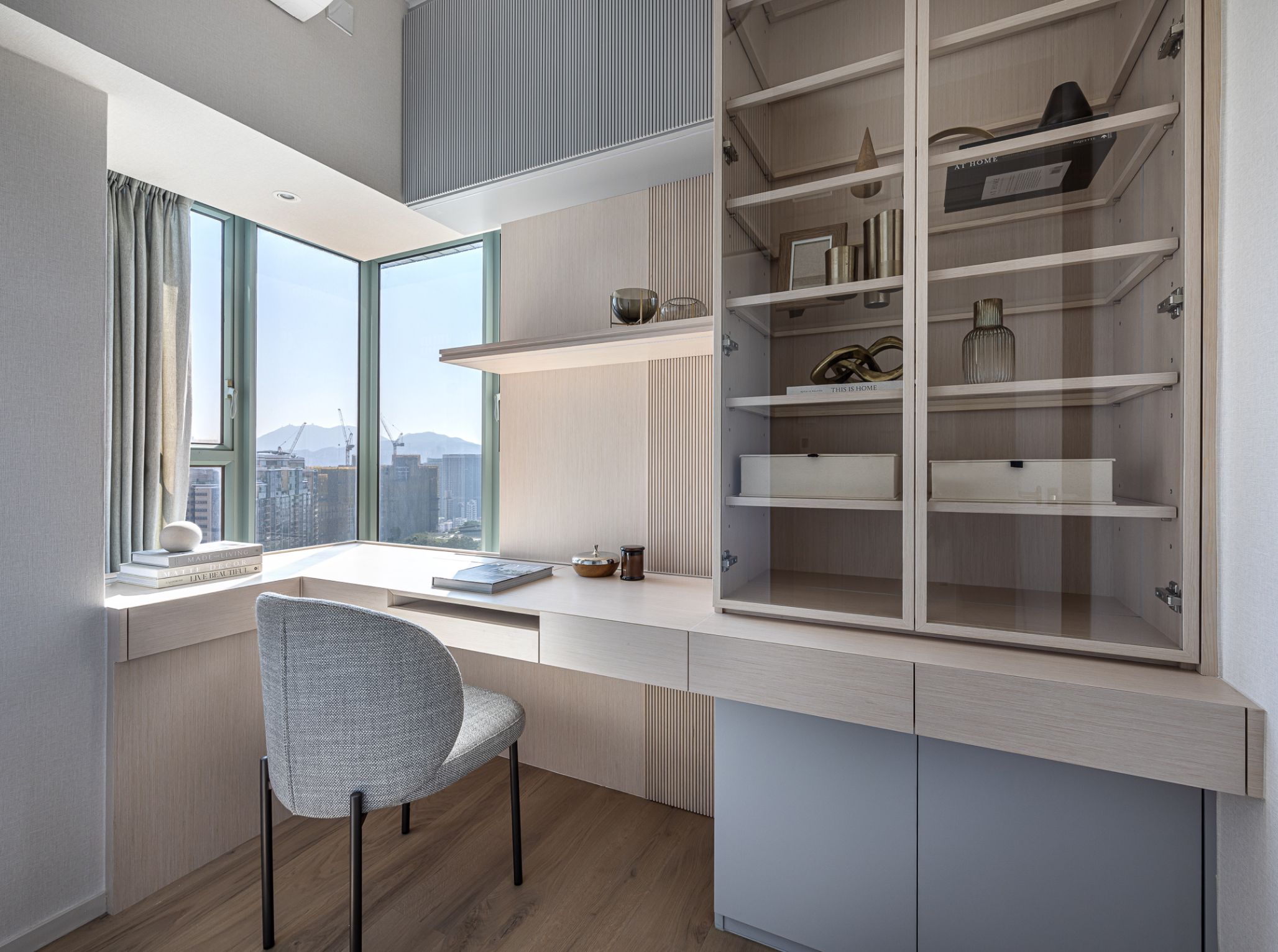
The other room has been transformed into a home office for the homeowner, completely separated from the bedroom to provide a high level of privacy for work. The design features L-shaped modular furniture, with a desk positioned by the window, allowing the homeowner to enjoy the view outside and relax during work breaks. Next to the desk, display cabinets have been designed to enhance storage functionality while effectively showcasing the homeowner's collections, adding a personalized touch to the space.

